
By Pratik Shah, Creative Head, PrintXpand. Disclosure: PrintXpand sells sign design and artwork approval software.
Most people who order a sign online expect it to be easy. Pick a template, type the business name, hit order. Ten minutes, done.
Then the sign arrives with the phone number sitting a quarter inch from the edge. Or the logo looks soft. Or the wording has a typo nobody noticed because the preview was the size of a postage stamp.
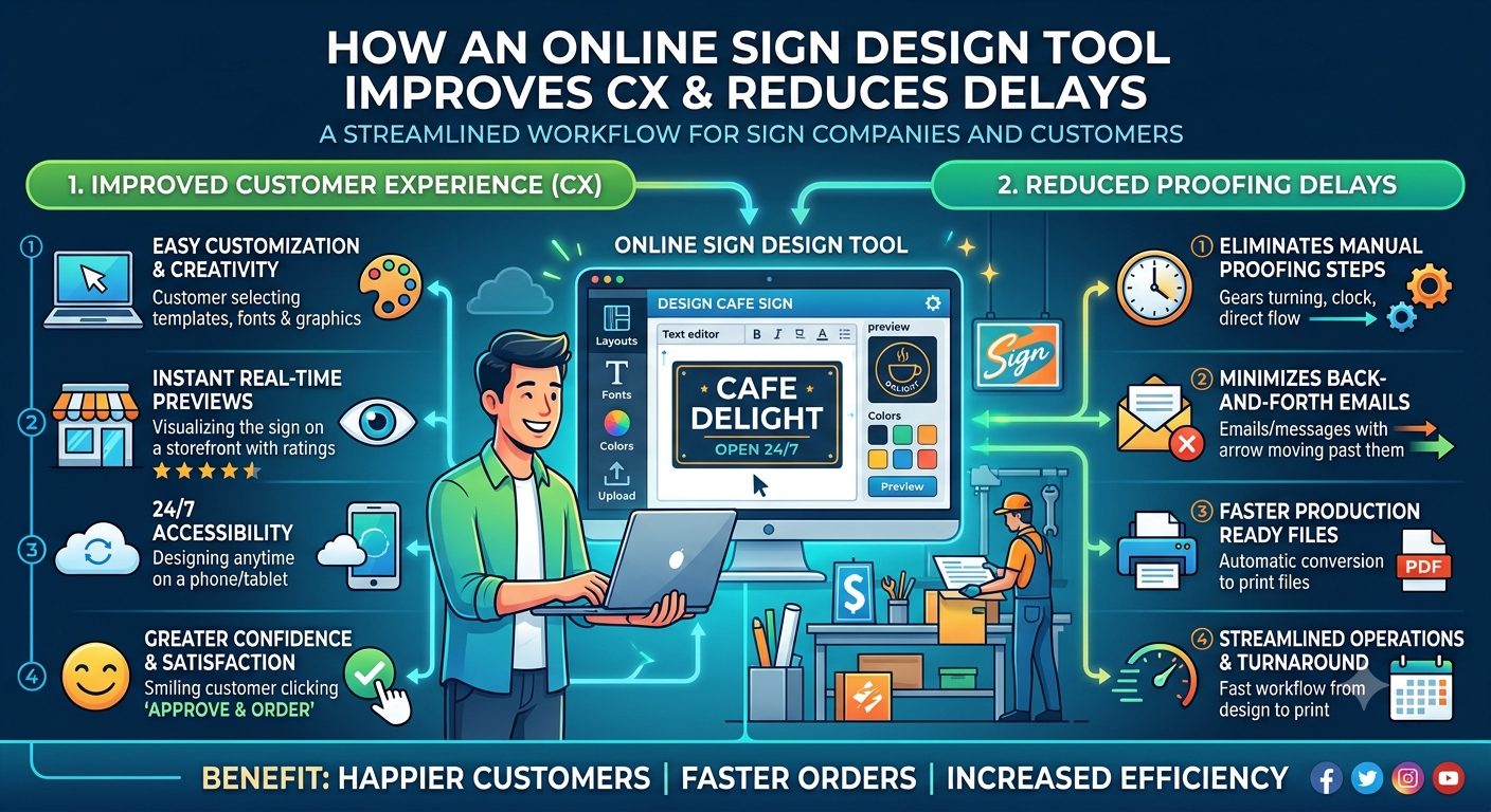
If you're a business owner buying a sign, that's the part nobody warns you about. A good online sign design tool does make ordering faster. But the real gain isn't speed. It's fewer surprises, and that is what cuts the back-and-forth proofing that eats a week.
Here's what to look for, whether you're buying a sign or choosing a tool to offer your own customers.
Easy is good, until it hides the decisions that matter
Templates are the best part of an online design tool. They give a first-time buyer a layout that already looks professional, so nobody starts from a blank rectangle.
But a template can also make a sign look finished long before it's ready to print. Everything lines up on screen. Nothing tells you the logo you uploaded is only 400 pixels wide, or that the text sits too near the trim line.
That's the tension. The easiest tools tend to hide the three things that decide whether a sign comes out right: size, image quality, and margins. The best ones do the opposite. They make the process smooth, then slow you down at exactly those three points.
Image quality: the check that saves the most reprints
Large signs don't need the same resolution as a business card, which surprises people. One banner printer puts the working standard at about 100 DPI at final size, and says files for banners around 8 feet wide and up can go lower. Another printer recommends at least 150 DPI. Either way, the number is measured at the size of the finished sign, not the size of the file on your screen.
That's where buyers get caught. A logo copied from a website looks sharp on a laptop. Stretched across a 6-foot banner, it falls apart.
A good tool checks this when you upload and tells you in plain language: this image is too small for the size you picked. It shouldn't wait until after checkout. And it should say what to do next, like upload a larger file or use a vector version of the logo.
Margins: where the phone number gets cut off
Printed signs get trimmed, and trimming isn't perfectly precise. That's why printers ask for bleed, extra background that runs past the cut line. Smart press, for example, asks for 0.125 inches of bleed on yard signs and 0.25 inches on a 22 by 28-inch sign. Without it, you can get a thin white edge.
The other half is the safe zone: keep anything important away from the edge. Alpha Graphics suggests at least an inch for banners.
Few buyers think about either. A tool can think about it for them. Show the safe zone as a faint guide on the canvas, extend the background automatically, and warn when text crosses the line. It's a small feature, and it prevents one of the most common mistakes in sign printing.
See it at the size it will hang
Design software shows a sign fitted to your screen. A 3 by 8-foot banner and a 12 by 18-inch yard sign look about the same in that view, and that's the problem.
So, ask whether the tool can show the sign at a believable scale. A size reference helps, such as a figure of a person standing next to it. A mockup on a storefront photo helps more. When customers can judge the real proportions, they stop sending proofs back with "can you make it bigger?" They've already seen it.
This won't solve everything. Colors on a backlit monitor never match vinyl exactly, and no preview can promise otherwise. If brand colors matter, ask for a printed sample. One sample cost far less than one reprint.
Where proofing delays really come from
Here's something that took me a while to appreciate: most of the delay in proofing isn't work. It's waiting.
A designer turns a revision around in minutes. The days go by while the buyer is busy, or unsure, or waiting on a partner to weigh in. Add three revision rounds and a sign-off, and what should take two days takes two weeks.
So, the question to ask about any tool is whether it reduces the number of rounds and makes each one easy to answer. If the buyer builds the first draft, the proof becomes a check of their own work, not a reaction to someone else's guess. A proof that shows the sign, not bleed lines and cut paths, is easier to answer. And a one-tap approval link, with an automatic reminder after a day or two, keeps it from sitting in an inbox.
What about the approval itself? Sign shops have argued about it for years. In a long-running forum thread, one shop owner said that without a sign-off procedure, "you're going to eat the job or lose the customer". A timestamped approval on a locked version protects both sides. It also pushes the buyer to read the proof properly, which is the point.
Know when to talk to a person
Self-serve works well for yard signs, banners, and simple wall panels. It's a poor fit for illuminated signs, channel letters, or anything mounted high. Those need a site visit, and no browser can do that.
A good tool knows its limits. For complex jobs, it should work as an intake form: collect the photos, the wording, and the files, then hand over to a human who quotes. The buyer still has a better experience, because the shop starts with a proper brief.
Conclusion
An online sign design tool improves the customer experience when it adds a few smart interruptions to an otherwise fast process: an image check, a margin guide, a real-scale preview and a one-step approval. Those are what shorten proofing, not the templates.
At PrintXpand, our online sign design too l gives customers a scale-accurate live preview and generates print-ready files with bleed and cut lines. Our artwork approval software adds mobile approvals, automated reminders, and a timestamped record of each approval. Whichever tool you use, try ordering your own sign through it once.
Count the places it made you stop and check. If it never did, expect surprises later.
About the Author
Pratik Shah is Creative Head at PrintXpand, a cloud and on-premise web-to-print and print automation platform serving 350+ print businesses across 40+ countries. He works with sign and print shops on online design and ordering. Learn more at printxpand.com.