
Choosing the right paint color can make a small room feel open and airy, or cramped and closed in. The good news is that with the right approach, even the smallest spaces can feel larger, brighter, and more intentional through color alone.
Why Color Matters More in Small Spaces
Color affects how light bounces around a room and how the eye perceives boundaries. In small spaces, the wrong choice can visually shrink a room further, while the right one can create an illusion of depth and openness.
Best Colors for Making Small Spaces Feel Larger
Soft Whites
Soft, warm whites reflect the most light, making them one of the most reliable choices for small rooms. Unlike stark, cool whites, warm whites avoid feeling clinical while still brightening the space.
Light Grays
Light gray offers a versatile, modern alternative to white, adding subtle depth without darkening the room. It also pairs well with a wide range of furniture and decor styles.
Pale Blues
Soft, pale blues create a calming, airy feel, often making small bathrooms or bedrooms feel more spacious and serene.
Soft Greens
Muted, soft greens bring warmth and a connection to nature without overwhelming a small space, working particularly well in kitchens and living areas.
Using Monochromatic Color Schemes
Match Walls, Trim, and Ceiling
Painting walls, trim, and ceiling in the same or very similar color removes visual breaks that can make a room feel choppy, creating a seamless flow that tricks the eye into perceiving more space.
Extend Color to the Ceiling
Carrying a light wall color up onto the ceiling, rather than defaulting to white, eliminates the visual “lid” effect that can make low ceilings feel more noticeable.
When Darker Colors Actually Work
Creating a Cozy, Intentional Feel
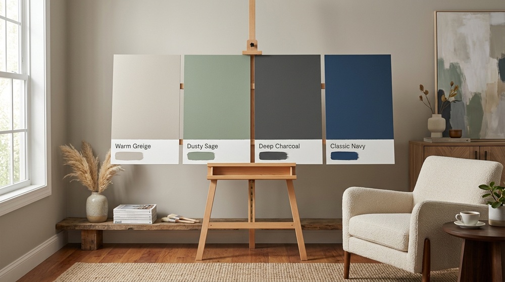
While light colors typically make spaces feel larger, deep, saturated colors—like navy or charcoal—can work beautifully in small spaces when the goal is a cozy, dramatic feel rather than an airy one, especially in powder rooms or reading nooks.
Enveloping One Small Room
Small spaces are often the best place to experiment with bold, dark colors precisely because the commitment is lower than doing an entire open floor plan.
Colors and Undertones to Watch For
Avoid Colors With Muddy Undertones
Some grays and beiges carry pink, green, or purple undertones that can look muddy or dated in certain lighting. Testing swatches under your room’s actual lighting conditions prevents unwelcome surprises.
Consider Natural Light Direction
North-facing rooms tend to receive cooler, bluer light, which can make cool paint colors feel colder. South-facing rooms receive warmer light, allowing a wider range of colors to feel balanced.
Practical Tips for Choosing Paint in Small Spaces
Test Before Committing
Paint large swatches directly on the wall and observe them at different times of day, since lighting changes significantly affect how a color reads throughout the day.
Consider Sheen, Not Just Color
Satin or eggshell finishes reflect more light than flat paint, which can help a small room feel brighter, though they also highlight wall imperfections more than matte finishes.
Coordinate With Natural Light and Room Function
A small home office may benefit from an energizing, brighter tone, while a small bedroom often works better with a softer, more restful color palette.
Final Thoughts
There’s no single “correct” paint color for small spaces, but light, warm neutrals remain the most reliable choice for creating an open, airy feel. For those wanting more personality, thoughtful use of bold or dark colors can transform a small room into a cozy, intentional space rather than one that simply feels cramped. Testing colors under real lighting conditions remains the most important step, regardless of which direction you choose.