
Most people spend months agonizing over paint colors and front door hardware, then screw a pack of hardware-store digits to the siding in ten minutes and never think about them again. It's a strange imbalance, because the address is the one element on a façade that every visitor, delivery driver, and passerby actually reads. Get it right and the whole entry looks deliberate. Get it wrong and no amount of landscaping will rescue the first impression.
This is a project with an unusually good effort-to-payoff ratio. You can plan it over a coffee, order the pieces, and install them in an afternoon. But the planning matters more than the drilling, and that's where most homeowners go sideways.
Start With the Sightline, Not the Style
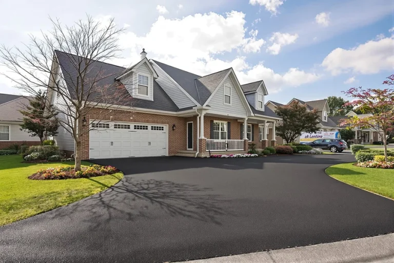
Before you look at a single font, go stand where people will actually read your address. Not on your porch — at the curb, in the street, in a car with the window down. Walk the approach from both directions. You'll learn three things fast: how far away the numbers need to be legible, whether a tree or porch post blocks the obvious spot, and whether your chosen wall sits in shade all day or gets blasted with afternoon sun.
That viewing distance drives height. As a rough working rule, numbers read comfortably at about one inch of character height for every ten feet of distance — so a house set 40 or 50 feet back from the street wants characters in the 5- to 6-inch range at minimum, while a townhouse entry two steps off the sidewalk can look overbearing with anything above 4 inches. Deep setbacks, uphill driveways, and hedges all argue for sizing up. If you're genuinely torn between two heights, the larger one almost always photographs and reads better; small numbers look timid on a big wall.
Horizontal, Vertical, or Stacked?
Orientation is an architectural decision more than an aesthetic one. Horizontal is the default and suits wide siding panels, garage headers, and the space beside a door. Vertical works beautifully on narrow pilasters, trim boards, and the slim wall between a door and a window — and it draws the eye upward on a tall, narrow entry. Stacked pairs (two digits over two digits) handle long four- and five-digit addresses on constrained walls without shrinking the characters. Measure the available clear space, subtract a couple of inches of breathing room on each side, and let the math narrow your choices.
Font and Finish: The Two Decisions People Regret
Font should echo the house, not compete with it. A clean geometric sans serif belongs on mid-century, modern, and contemporary homes; a slightly humanist sans reads warmer on craftsman and transitional exteriors; a condensed face buys you legibility when horizontal space is tight. What rarely works is a decorative script at a distance — the strokes collapse into one another and the number becomes a texture rather than information.
Finish is about contrast against the wall behind it, and this is where the shade-versus-sun observation pays off. Dark characters on light stucco or pale siding are the most legible combination there is. Light or satin-metal characters on a dark wall work equally well. The failure case is a brushed or natural metal finish on a mid-tone gray or beige wall in full shade, where the numbers quietly disappear. Brick is its own puzzle: the mortar lines create visual noise, so either go bold with high contrast or mount the numbers on a plaque that gives them a clean background. If you want a broader survey of materials, mounting styles, and how different options hold up outdoors, the roundup of address number options and buying considerations at Bob Vila is a sensible place to calibrate expectations before you commit.
Flush, Floating, or Plaque
Flush-mounted characters sit directly against the wall — simplest to install, and the right call on textured surfaces where a gap would look sloppy. Float or standoff mounting holds the characters a half-inch or so off the wall, which throws a shadow line behind them. In bright sun that shadow adds real depth and a custom-architect look; in permanent shade, the effect is subtle and you may prefer flush. Plaques solve different problems: they give you one clean mounting operation instead of several, they work on brick and stone where precise multi-hole alignment is miserable, and they let you combine the number with a street name or a welcome message.
Where to Order When You Want It to Look Intentional
Once you've settled on height, orientation, font, and finish, you need a maker who will actually produce that combination rather than offer you the nearest stock equivalent. Modern House Numbers, a family-run workshop that has been making to order in Tucson, Arizona since 2008, cuts its custom house numbers and letters from solid recycled aluminum in a curated range of fonts, finishes, heights, and orientations, alongside address plaques, welcome signs, mailbox decals, and curb stencils. The detail installers appreciate most is what ships with the order: a free personalized full-scale drilling template, step-by-step instructions, and concealed hardware, so the spacing you approved on screen is the spacing you get on the wall. There's also a QuickShip range for tighter timelines, a trade program for designers and builders, and bespoke work for projects that don't fit a standard configuration — useful if you're coordinating signage across multiple units or matching an unusual entry.
Installing Without Drilling Twice
The single biggest favor you can do yourself is to tape the template or a paper mock-up in place and leave it there for a day. Look at it in morning light, at dusk, from the street, and from a car. Crooked-looking placement that seems fine on a ladder often reads badly from the sidewalk, and the eye is unforgiving about a number that sits slightly low or off-center relative to a door or window.
A practical sequence that avoids rework:
- Confirm mounting height — generally at or slightly above eye level, and never behind a screen door, storm door, or plant that will grow.
- Use a level on the template, then measure down from a fixed reference like a trim line rather than up from uneven ground.
- Check for what's behind the wall. Avoid drilling blind into siding where wiring or a stud edge might be, and on brick drill into the brick face rather than the mortar joint for a stronger hold.
- Match the bit to the substrate: masonry bit and anchors for brick or stucco, a smaller pilot hole for wood.
- Drill one hole, test-fit one character, then proceed. If the first one is right, the rest will follow the template.
Allow an hour or two for a standard install, more if you're working on masonry or on a ladder. It sits comfortably alongside the kind of easy weekend home improvement projects anyone can complete — low tool requirements, visible results, and nothing that can't be paused halfway through for lunch.
Finishing the Picture
Numbers don't operate alone. A fixture or wall sconce near them transforms nighttime legibility, and nothing undermines a thoughtful address more than being invisible after dark. Keep shrubs trimmed back from the sightline. If your mailbox or curb also carries the number, use the same font family so the elements read as a set rather than three unrelated decisions. And resist the urge to add decorative flourishes around the digits; the restraint is what makes a modern address look considered.
Do the measuring, respect the sightline, pick contrast over cleverness, and you end up with a small piece of your house that works every single day — for guests, for drivers, and for you, every time you pull into the driveway.