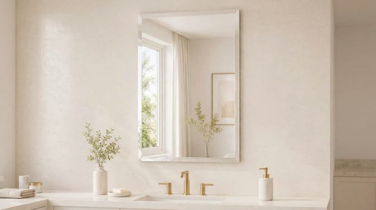

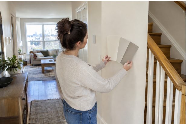
A whole-home paint palette can make an Ottawa home feel calmer, more connected, and easier to update over time. That does not mean every room needs the same wall color. The goal is to create a clear relationship between rooms, especially where hallways, staircases, open-concept areas, and doorways create direct sightlines.
For homeowners who want a professional finish after settling on colors, Ottawa interior painting services from Oliver Painting can help turn the plan into a finished space. Oliver Painting is an Ottawa-based residential and commercial painting company that handles walls, ceilings, trim, doors, drywall repair, wallpapering, and specialty finishes in communities including Kanata, Barrhaven, Nepean, and Stittsville. That hands-on scope matters when a cohesive palette depends on smooth surfaces, crisp transitions, and consistent finishes.
Why A Whole-Home Palette Works
Choosing colors one room at a time can lead to abrupt changes from one space to the next. A connected palette gives each room its own identity while keeping the house visually balanced. In 2026, interior color trends include grounded yet expressive palettes with earthy browns, softer blues, and greens, along with expressive accents. Trends can spark ideas, but the best palette is one that suits the home's materials, light, and daily routines.
Start With Fixed Features
Paint is easier and less costly to change than flooring, cabinets, counters, tile, brick, stone, fireplaces, and exposed wood. Begin by identifying the undertones already present in those features. A grey floor may lean blue, beige, green, or pink. Wood can read golden, red, or neutral. White cabinetry may be bright, creamy, or slightly grey.
Ottawa's changing seasons also make testing important. A room can look quite different in bright summer daylight, overcast weather, and evening artificial light. Consider the existing trim, windows, interior doors, and major furnishings before committing to a shade.
Choose A Simple Colour Structure
A practical palette usually needs only three core roles:
- Main color: A flexible shade for most walls and larger connected spaces.
- Supporting color: A related shade for bedrooms, offices, dining rooms, or smaller areas.
- Accent color: A deeper or brighter tone for a powder room, built-in, feature wall, door, or ceiling.
These colors do not need to match. They need something in common, such as a similar warmth, undertone, or depth. For example, warm off-white walls can connect naturally with muted olive in a den and a deep brown or soft navy on a door.
Use The 60-30-10 Rule Loosely.
The 60-30-10 guideline is a helpful starting point, not a strict formula. Think of it as the overall visual balance of a room:
- 60 percent: the dominant backdrop, often walls or a large rug.
- 30 percent: the supporting tone, carried through upholstery, drapery, cabinetry, or a secondary wall color.
- 10 percent: the accent, used in art, pillows, lamps, doors, or limited painted details.
A warm neutral, muted green, and rich blue-grey can work well together when each color appears in more than one place. Repeating a small accent from room to room helps the home feel intentional.
Match Color To The Room's Purpose
Living Rooms And Bedrooms
Living rooms often suit comfortable mid-tone neutrals, warm off-whites, soft greens, or clay-based shades. Larger rooms can usually carry more visual depth than narrow spaces. Bedrooms benefit from quieter colors such as dusty blue, gentle taupe, muted green, or soft brown. Highly saturated shades can be effective, but they are often easier to live with on one wall, a door, or built-in furniture rather than on every surface.
Kitchens, Dining Areas, And Bathrooms
In kitchens and dining areas, relate the wall color to cabinets, counters, flooring, and backsplash materials before choosing a dramatic hue. A stronger color can work well on an island, pantry door, or dining-room wall when the rest of the room is restrained. Smaller bathrooms and powder rooms can handle deeper color because they are brief, contained experiences. Use paint suited to the room's moisture and ventilation conditions.
Include Ceilings, Trim, And Doors
Ceilings, trim, and doors are part of the palette, not afterthoughts. Bright white trim creates contrast, while a softer white or cream can better suit warmer walls. Color-matched trim creates a quieter, more enveloping look. A painted interior door or baseboard can add definition without introducing another wall color.
Before painting, repair nail pops, dents, cracks, stains, loose paint, damaged seams, and old wallpaper adhesive. Fresh paint does not permanently conceal major surface flaws, and dark or glossy finishes can make uneven areas more noticeable.
Test Colors In Real Light
- Paint large samples on multiple walls.
- View them in morning, afternoon, and evening light.
- Compare them with flooring, furnishings, counters, and trim.
- Leave samples up for at least a full day.
- Do not rely on a small paint chip or digital image alone.
North-facing rooms often appear cooler, while south-facing rooms typically receive warmer, brighter daylight. Sample testing reveals whether an undertone that looked subtle in the store becomes too grey, yellow, green, or blue at home.
Use Trends As Inspiration, Not Instructions
Current design reports can broaden your options, particularly when considering warmer palettes, natural materials, and purpose-built rooms. The emerging home design preferences reported in 2026 are useful for inspiration, but a popular shade may still clash with a home's lighting or permanent finishes. Choose colors that feel comfortable in everyday life, not only colors that photograph well online.
Plan The Work In The Right Order
- Confirm the palette and finish plan.
- Remove décor and protect floors and furniture.
- Complete drywall repairs and surface preparation.
- Paint ceilings before walls.
- Paint trim, doors, and baseboards.
- Paint the walls, then complete touch-ups after they dry.
Common Questions
Should Every Room Have The Same Paint Color?
No. One shared color can create continuity, but a small family of related shades often gives each room more character.
What Is Best For Resale?
Flexible neutrals generally appeal to a broad range of buyers. Personal colors can still work well in smaller rooms, doors, or controlled accent areas.
Should Ceilings Always Be White?
White is dependable, but softer whites, pale tints, and carefully chosen deeper colors can create a finished look.
Final Checklist
- Do the colors work with flooring, cabinets, tile, and wood?
- Have samples been checked in changing light?
- Do trim, doors, and ceilings fit the plan?
- Have surface repairs been completed?
- Will the palette still feel comfortable after trends change?
A cohesive palette is less about finding one perfect color and more about making thoughtful connections. With careful testing, sound preparation, and colors suited to how each room is used, Ottawa homeowners can create a home that feels unified without looking repetitive.